WCAG Color Contrast Explained: AA vs AAA
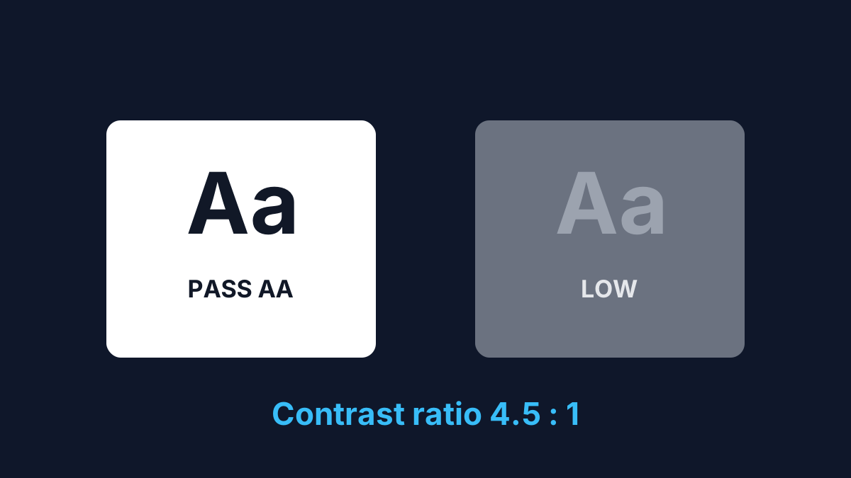
Readable text needs enough contrast between the text colour and its background. The Web Content Accessibility Guidelines (WCAG) turn "enough" into a measurable contrast ratio from 1:1 (no contrast) to 21:1 (black on white).
The thresholds
| Level | Normal text | Large text |
|---|---|---|
| AA | 4.5:1 | 3:1 |
| AAA | 7:1 | 4.5:1 |
"Large text" means at least 24px, or 18.66px (14pt) bold. AA is the level most sites and legal requirements target; AAA is stricter and often reserved for body text where accessibility is critical.
How the ratio is calculated
Contrast compares the relative luminance of the two colours: (L1 + 0.05) ÷ (L2 + 0.05), where L1 is the lighter colour and L2 the darker. You don't need to compute it by hand — but it explains why two colours that look different can still fail, and why mid-greys are risky.
A reference point
#767676 text on a white background is exactly 4.54:1 — the darkest grey that still passes AA for normal text. Anything lighter fails. Neither passes AAA, which needs 7:1.
Common mistakes
- Testing with semi-transparent colours — flatten opacity against the real background first.
- Forgetting large text only needs 3:1 (AA), so headings pass more easily than body copy.
Check any pair in your browser
Paste your colours into the Color Contrast Checker to see the ratio and pass/fail for AA and AAA at both sizes instantly.
Sources
Ready to do it?
Open the Color Contrast Checker