Tools used in this post
A social post can look perfect in your editor and still appear broken after publishing. A username may cover the headline, engagement buttons may overlap a call to action, or a caption may hide the lower part of the design.
This usually happens because TikTok, Instagram Reels, and YouTube Shorts place interface elements over vertical content. The solution is not simply exporting the correct image dimensions. You also need to keep important content inside a social media safe zone.
This guide explains how safe zones work, where to place text and logos, and how to check a design before publishing it.
You can also preview your design with the free Social Media Safe Zone Checker.
What is a social media safe zone?
A social media safe zone is the part of an image or video that is least likely to be covered by interface elements.
These interface elements can include:
- Account names and profile pictures
- Captions and descriptions
- Like, comment, and share buttons
- Audio or music information
- Follow buttons
- Navigation controls
- Device status and gesture areas
The full canvas is still visible content, but it is not all equally suitable for important information.
Background images, decorative shapes, gradients, and textures can extend to the edges. Headlines, logos, faces, prices, and calls to action should remain closer to the center.
Safe zones are especially important for vertical 9:16 content because several controls are layered directly over the image or video.
Why correct image dimensions are not enough
Using the recommended dimensions prevents basic scaling and aspect-ratio problems, but it does not guarantee that every element will remain visible.
For example, a 1080 × 1920 design has the correct 9:16 aspect ratio for TikTok, Instagram Reels, and YouTube Shorts. However, text placed at the bottom of that canvas may still be covered by a caption or navigation controls.
There are two separate requirements:
- Use the correct canvas size and aspect ratio.
- Keep important content away from likely interface overlays.
A design can satisfy the first requirement and still fail the second.
Social media dimensions and practical safe-zone guidelines
The following measurements are practical starting points for a 1080 × 1920 vertical canvas. They are intentionally conservative so one design can work across several platforms.
| Platform | Recommended canvas | Aspect ratio | Practical placement guidance |
|---|---|---|---|
| TikTok | 1080 × 1920 px | 9:16 | Keep important content away from the top, lower section, and right-side controls |
| Instagram Reels | 1080 × 1920 px | 9:16 | Keep text centered and allow extra room near the bottom for captions |
| YouTube Shorts | 1080 × 1920 px | 9:16 | Avoid placing essential text near the bottom or right edge |
| Instagram Stories | 1080 × 1920 px | 9:16 | Leave space at the top and bottom for account and reply controls |
| Facebook Stories | 1080 × 1920 px | 9:16 | Keep essential content within the central area |
| Instagram portrait post | 1080 × 1350 px | 4:5 | Avoid placing text too close to any edge |
| Facebook feed image | 1200 × 1500 px | 4:5 | Use comfortable margins around text and logos |
| LinkedIn portrait post | 1200 × 1500 px | 4:5 | Keep headlines and branding inside a centered content area |
For a cross-platform 1080 × 1920 design, a useful starting point is to reserve approximately:
- 270 pixels at the top
- 120 pixels along the left edge
- 180 pixels along the right edge
- 385 pixels at the bottom
These are not permanent platform specifications. Interface layouts can change depending on the device, app version, account type, placement, and caption length.
Treat these measurements as conservative design guidance, then preview each design before publishing it.
Check your design before publishing
Upload your image to the Social Media Safe Zone Checker to preview the areas that may be covered on TikTok, Instagram Reels, YouTube Shorts, and other social placements.
The checker displays an overlay on your design so you can identify problems before publishing.
A safe-zone checker is useful for reviewing:
- Headlines
- Subheadings
- Logos
- Product names
- Prices
- Discount codes
- Calls to action
- Faces
- Screenshots
- Important product details
Move any essential element that enters a warning area closer to the center.
A simple map of the danger zones
On a vertical 1080 × 1920 canvas, think of the layout as five areas:
- The top danger area, where account information or navigation may appear
- The left margin, which protects content from tight cropping
- The central safe area, where essential information should remain
- The right danger area, where engagement buttons are often displayed
- The bottom danger area, where captions, audio information, and controls may appear
The center is the most reliable location for information that must be seen. The outer areas are better suited to backgrounds and decorative elements.
Three rules for designing safer social graphics
1. Keep essential content in the central area
Headlines, logos, product names, faces, and calls to action should remain inside the central part of the canvas.
Background images and decorative elements can extend beyond this area because they are not required to communicate the main message.
2. Leave more room at the bottom
The bottom of a vertical post is commonly used for captions, audio information, navigation, and other controls.
Avoid placing a headline, URL, price, coupon code, or button-shaped graphic close to the bottom edge.
If a caption is likely to be long, provide even more space.
3. Protect the right side
TikTok, Instagram Reels, and YouTube Shorts commonly display engagement controls on the right side of the screen.
Do not place important text, a face, a product feature, or a logo directly beneath these controls.
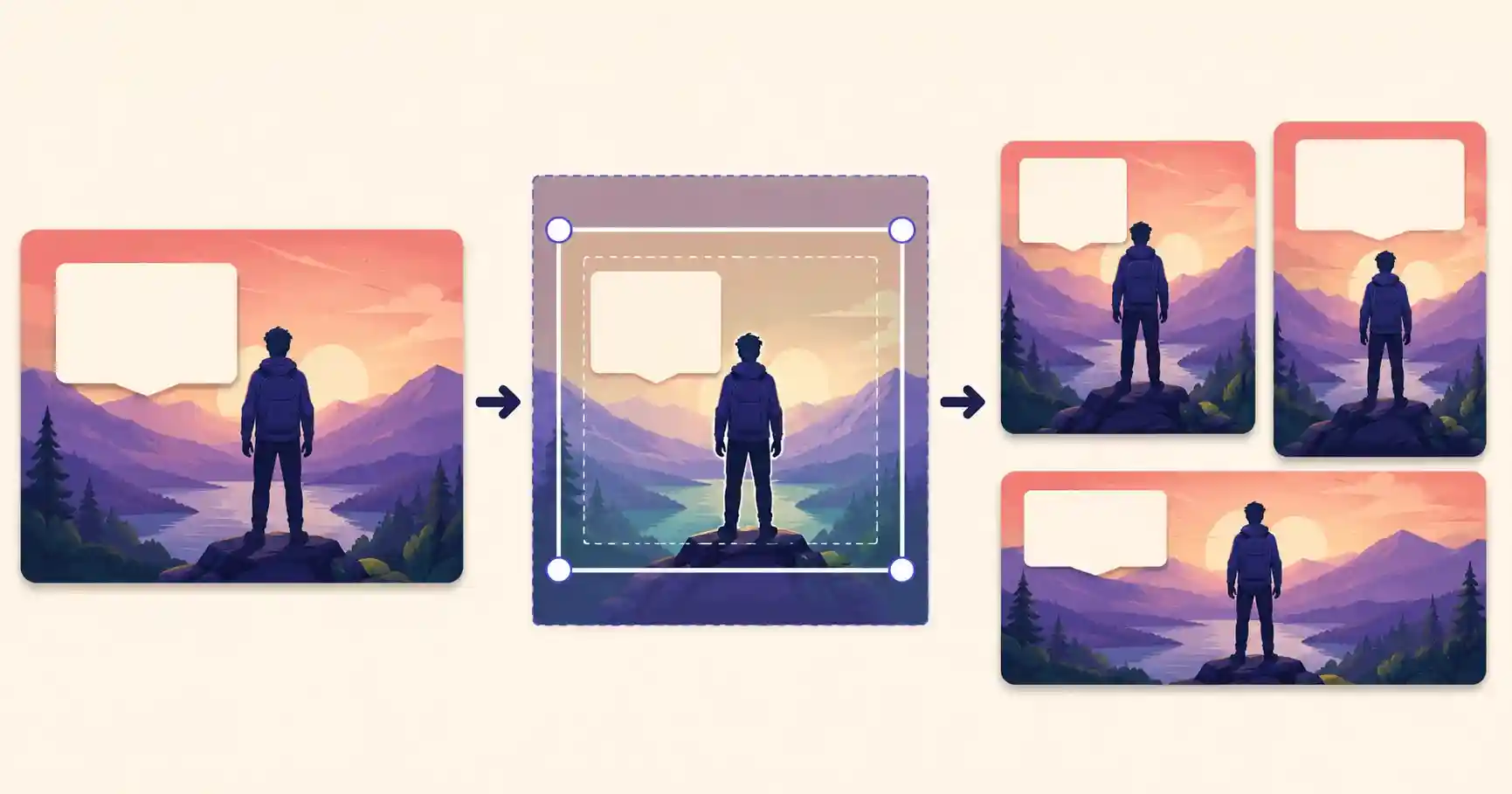
How to crop an image for social media safe zones
Cropping for social media requires more than selecting a 9:16 aspect ratio. The crop should also leave enough empty space around the subject for text and interface overlays.
Use this process:
- Choose the platform and target aspect ratio.
- Crop the image without placing the subject against an edge.
- Leave room above, below, and beside the subject.
- Add the headline and other essential elements inside the central area.
- Preview the finished design with a safe-zone overlay.
- Move any covered elements inward.
- Export and review the final file at full size.
If the original image is too tightly framed, consider using a different photograph or extending the background rather than forcing the subject into a crowded composition.
You can prepare the image with the Online Image Cropper, adjust its dimensions with the Free Image Resizer, and then review it using the Social Media Safe Zone Checker.
Check Your Design Against Real Platform Overlays
Upload your image, select a platform and see whether captions, buttons or cropping will cover important text. Everything runs privately in your browser.
A repeatable pre-publish workflow
A consistent workflow makes safe-zone mistakes much easier to prevent.
Step 1: Select the destination
Decide whether the design is intended for TikTok, Instagram Reels, YouTube Shorts, Stories, or a feed post.
The platform determines the canvas size and the types of overlays you should expect.
Step 2: Create the correct canvas
For vertical short-form content, start with a 1080 × 1920 canvas using a 9:16 aspect ratio.
For portrait feed posts, a 1080 × 1350 or 1200 × 1500 canvas may be more suitable, depending on the platform.
Step 3: Crop the main image
Position the subject with enough space around it. Avoid placing a face, product, or other focal point against the bottom or right edge.
Step 4: Add a safe-zone overlay
Use an overlay while designing or preview the completed image with the Social Media Safe Zone Checker.
The overlay should be treated as a layout guide, not part of the exported design.
Step 5: Add the essential content
Place the following elements inside the clearest central area:
- Primary headline
- Logo
- Product name
- Price or offer
- Call to action
- Important visual details
Secondary decoration can extend farther toward the edges.
Step 6: Preview the final export
Check the exported file rather than reviewing only the editable design.
Export settings, scaling, and cropping can change the final placement of elements.
Step 7: Test on the destination platform
For important campaigns, upload the post as a draft or private test when the platform allows it.
Check the design on more than one phone size if possible.
Common safe-zone mistakes
Placing text too close to the bottom
This is one of the most common problems. Captions and interface controls can cover lower-third text even when the design looks balanced in an editor.
Move essential text upward and leave the bottom section available for platform overlays.
Using the entire canvas for essential information
A 1080 × 1920 canvas should not be treated as one large text area.
Use the outer sections for photography, color, texture, and decoration. Keep the main message in the center.
Placing a logo in the right corner
The right side is often occupied by engagement controls. A logo placed there may be partially covered or difficult to notice.
Move it toward the upper center or left-center area while maintaining adequate margins.
Using extremely small text
Text may technically remain visible but still be unreadable on a phone.
Preview the design at actual mobile size. Increase the font size or shorten the message if it requires effort to read.
Relying on one screenshot template forever
Platform interfaces change. A layout that worked several months ago may no longer be reliable.
Verify important designs against current platform previews and official documentation.
Ignoring caption length
A short caption and a long caption may occupy different amounts of screen space.
If the post will contain a detailed description, leave additional room near the bottom.
Exporting without a final check
An element may shift when a design is resized, cropped, or exported.
Always review the actual exported image or video frame.
Platform-by-platform guidance
TikTok
TikTok places several interactive elements over vertical content, particularly along the right side and lower part of the screen.
For safer TikTok designs:
- Keep headlines away from the top and bottom edges.
- Avoid placing text beneath the right-side engagement controls.
- Keep faces and product details close to the center.
- Allow extra bottom space when using longer descriptions.
- Preview promotional content carefully because additional advertising elements may appear.
Instagram Reels
Instagram Reels may display account information, captions, audio details, and engagement controls over a video or cover image.
For safer Reel designs:
- Keep the main headline in the middle section.
- Avoid placing essential content at the bottom.
- Remember that a Reel cover may also be cropped when displayed in the profile grid.
- Check both the full-screen Reel and its profile-grid preview.
- Keep branding readable without relying on a corner position.
YouTube Shorts
YouTube Shorts uses a vertical interface with engagement and navigation controls placed over the video.
For safer Shorts designs:
- Keep calls to action away from the bottom and right edges.
- Use large, high-contrast text.
- Avoid positioning a subject where interface controls may cover the face.
- Review the title and thumbnail presentation separately from the in-video layout.
Instagram and Facebook Stories
Stories typically include account information near the top and reply or navigation controls near the bottom.
For safer Story designs:
- Keep important text within the central area.
- Avoid placing links, prices, or instructions near the bottom edge.
- Leave enough space for stickers or interactive elements.
- Preview the final Story inside the platform before publishing.
Portrait feed posts
Feed images usually have fewer interface overlays than full-screen vertical content, but edge cropping and preview differences can still occur.
For safer feed images:
- Maintain consistent margins.
- Keep headlines away from the extreme top and bottom.
- Preview how the image appears in the feed and profile grid.
- Make sure the first line of text remains clear at smaller sizes.
Can one design be reused across platforms?
Yes, but the design should be created around a shared central safe area.
For TikTok, Instagram Reels, and YouTube Shorts, start with a 1080 × 1920 canvas and keep all essential content inside the central portion.
Background images and decorative elements can extend to the edges. Headlines, logos, faces, prices, and calls to action should remain centered.
This approach can reduce production time, but each version should still be previewed separately because the platforms do not use identical interfaces.
For important campaigns, create platform-specific versions when:
- The call to action must appear in a precise location
- The design contains a large amount of text
- A product or face occupies most of the frame
- Captions are long
- The content will be used for paid advertising
- Profile-grid presentation is important
Accessibility is also part of safe design
Safe placement does not automatically make a design easy to understand.
A design should also remain readable for people using different devices, screen brightness levels, and accessibility settings.
Use these practices:
- Create strong contrast between text and the background.
- Avoid placing text over visually busy areas.
- Use a readable font size.
- Keep headlines concise.
- Do not communicate essential meaning through color alone.
- Add captions to spoken video content.
- Use meaningful alt text when the platform supports it.
- Check the design at actual phone size.
A message that is visible but difficult to read is not truly safe.
Frequently asked questions
What is the safest area for a 1080 × 1920 design?
The central portion of the canvas is the safest location for essential content.
As a conservative starting point, reserve approximately 270 pixels at the top, 385 pixels at the bottom, 120 pixels on the left, and 180 pixels on the right.
These measurements are practical guidelines rather than permanent platform specifications. Always preview the final design.
Are TikTok and Instagram Reels safe zones the same?
No. Both platforms use a 9:16 vertical format, but their interface elements and overlay positions are not identical.
A shared central safe area can work for both, but each design should be checked separately.
Can I use the same 1080 × 1920 design on TikTok, Reels, and Shorts?
Yes. A 1080 × 1920 canvas is suitable for all three platforms.
Keep important content inside a conservative central area and preview the design for every destination before publishing.
Do social media safe zones change?
Yes. Safe zones can change when platforms update their interfaces.
They may also vary based on device size, operating system, app version, account type, caption length, advertising format, and the placement where the content is viewed.
Should backgrounds stay inside the safe zone?
No. Background photographs, colors, gradients, textures, and decorative shapes can extend to the edges of the canvas.
The safe zone is primarily intended for essential information such as text, logos, faces, products, prices, and calls to action.
Does the Social Media Safe Zone Checker upload my image?
The checker is designed to help you preview your content against platform overlays. Review the privacy information shown on the tool page for the current image-processing details.
Check your design before posting
Correct dimensions are only the first step. The next step is making sure viewers can actually see the message.
Keep important elements in the center, protect the bottom and right sides, use readable text, and check the exported design before publishing.
Use the free Social Media Safe Zone Checker to preview your image for TikTok, Instagram Reels, YouTube Shorts, Stories, and other social placements.
You can also use the Online Image Cropper and Free Image Resizer to prepare the image before checking its layout.
Sources and verification
Safe-zone layouts can vary across devices, app versions, account types, and content placements. The recommendations in this guide are conservative design guidelines based on current platform interfaces and documentation.
- TikTok Business: Safe-zone specifications
- Meta Business Help Center
- Instagram Help Center
- YouTube Help Center
Last verified: August 2026.