Tools used in this post
Here is an uncomfortable statistic: if your website takes longer than three seconds to load, more than half of your mobile visitors will leave before they ever see your content. And the single most common reason websites load slowly is not bloated code or slow servers — it is uncompressed images. A single photo straight off a modern phone can weigh 5 MB or more. Put three or four of those on one page and you have built a slow, ranking-damaging experience without writing a line of bad code.
The good news is that image compression is one of the highest-leverage, lowest-effort optimizations available. Done correctly, you can cut a file by 70–80% with no visible difference. Done carelessly, you get a muddy, artifact-ridden mess. This guide shows you how to land firmly on the "invisible" side of that line.
What image compression actually does
Compression reduces the number of bytes needed to store an image. There are two approaches, and knowing the difference is the whole game.
Lossless compression reorganizes and de-duplicates data so the image can be rebuilt perfectly, pixel-for-pixel. Nothing is thrown away. The trade-off is modest savings — typically 10–20% for a photo.
- Best for: archival photography, print masters, logos, medical or legal imaging where every pixel is evidence.
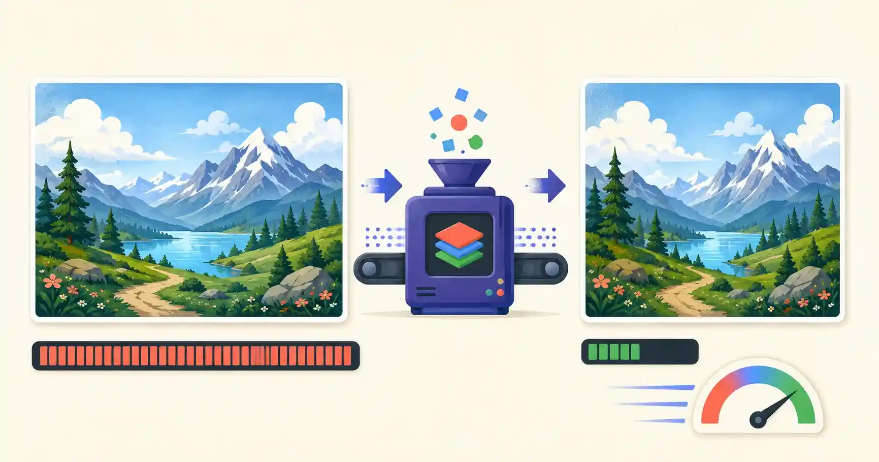
Lossy compression goes further by permanently discarding information your eyes struggle to perceive at normal viewing distances — subtle tonal shifts, high-frequency texture. The result is far smaller files.
- Best for: website banners, blog photos, eCommerce listings, and social posts.
- Typical savings: 70–80% with virtually no perceptible loss when done at a sensible quality level.
The core insight: your website almost never needs lossless images. Screens are lower resolution than print, viewing distances are longer, and visitors care far more about speed than about pixel-perfect fidelity they cannot see anyway.
Target file sizes for web performance
You cannot optimize what you do not measure. Use these battle-tested targets to pass Google's LCP benchmarks. If your images are far above these numbers, that is where your speed is going.
| Image use case | Max dimensions | Target file size |
|---|---|---|
| Hero banners / backgrounds | 1920×1080 px | Under 200 KB |
| Standard blog photos | 1200×800 px | Under 100 KB |
| eCommerce product photos | 1000×1000 px | Under 80 KB |
| Thumbnails & UI icons | 300×300 px | Under 20 KB |
The three levers of file size
Every compression decision comes down to three controls. Pull them in the right order and you win almost every time.
Step 1 — Resize the pixel dimensions first
This is the step most people skip, and it is the most powerful. A photo from a phone or DSLR might be 6000×4000 pixels. Your blog column is maybe 800 pixels wide, and even a full-width hero rarely exceeds 1920. Serving a 6000-pixel image into an 800-pixel slot means the browser downloads roughly fifty times more data than it displays.
Because file size scales with the area of an image, halving both dimensions cuts the pixel count to a quarter. Resizing to match your actual display container often does more for file size than any quality slider. Always resize before you compress.
Step 2 — Strip heavy metadata
Camera files carry hidden EXIF data: the camera model, lens, exposure settings, timestamp, and — critically — GPS coordinates. This metadata bloats the file and can leak your location. Removing it shrinks the file and protects your privacy in one move. For a batch of photos, this adds up quickly.
Step 3 — Apply smart lossy compression
Finally, pass the resized image through a lossy compressor set to roughly 80–85% quality. This is the sweet spot: a large size reduction while keeping the output clean and crisp. Below about 60%, artifacts (blocky patches, halos around edges) start to become visible; reserve those settings for genuine emergencies.
A worked example
Imagine a 4.2 MB, 4000×3000 JPG hero image straight from a camera:
- Resize to 1600×1200 (plenty for a full-width web hero). This alone cuts the data dramatically.
- Strip EXIF to remove camera and GPS metadata.
- Compress at quality 80.
The result lands around 180 KB — comfortably under the 200 KB hero target, sharp at screen size, and roughly 95% smaller than the original. Your LCP thanks you.
Format matters too
Compression and format work together. For photographs, WebP at quality 80 will usually beat a JPG at the same visual quality by 25–35%. For flat graphics and logos, lossless PNG or SVG is the right call. If you are unsure which format to standardize on, our companion guide on WebP vs JPG vs PNG breaks down the decision.
Common compression mistakes to avoid
- Compressing without resizing. You will hit diminishing returns fast. Resize first, always.
- Re-compressing an already-compressed file. Each lossy save degrades the image. Start from the highest-quality original.
- Using one quality setting for everything. A busy photo hides artifacts; a flat graphic exposes them. Preview each result.
- Forgetting thumbnails. A gallery of "small" images can still be megabytes if each thumbnail is a full-size file scaled down in HTML.
Compress your images instantly
You do not need Photoshop or a paid plan to hit these targets. The tools below run entirely in your browser — your private images are never uploaded to a remote server.
Shrink Your Images in Seconds
Optimize your site's performance without expensive software. Everything runs locally in your browser:
- 🗜️ Image Compressor: Reduce JPG, PNG, and WebP file sizes by up to 80% without visible quality loss.
- 📐 Image Resizer: Downscale giant pixel dimensions to exact, web-ready sizes.
- 🧹 EXIF Cleaner: Strip invisible metadata and GPS data from your photos before publishing.
🔒 100% client-side privacy: all files are compressed directly inside your browser window and are never uploaded to remote servers.
Compression and Core Web Vitals
Image compression does not just make files smaller; it directly moves the metrics Google uses to judge your page experience. The most affected is Largest Contentful Paint (LCP) — the time until your biggest visible element (usually a hero image) finishes rendering. A bloated hero is the single most common reason a page fails LCP on mobile. Compressing and correctly sizing that one image often lifts a page from "poor" to "good" on its own.
There is a subtler win too. Explicitly setting each image's width and height (or a CSS aspect ratio) lets the browser reserve the right space before the file arrives, which prevents layout shift — the "CLS" metric. So the complete performance recipe is: resize to the display size, compress at a sensible quality, serve a modern format, and declare dimensions. Miss any one and the others cannot fully compensate.
Responsive images: serve the right size to every device
A single fixed image is a compromise — too large for phones, too small for retina desktops. The srcset attribute lets you provide several sizes and let the browser choose:
<img
  src="photo-800.jpg"
  srcset="photo-400.jpg 400w, photo-800.jpg 800w, photo-1600.jpg 1600w"
  sizes="(max-width: 600px) 100vw, 800px"
  alt="Descriptive text"
  width="800" height="533" />
Now a phone downloads the 400-pixel version while a large screen gets the 1600-pixel one. Combined with compression, responsive images are the difference between a page that is merely "optimized" and one that is genuinely fast for everyone.
Automating compression in your workflow
Compressing images one at a time is fine for a blog post, but at scale you want it built into your process. Many teams compress on upload, generate multiple responsive sizes automatically, and convert to WebP or AVIF as part of their build or CDN pipeline. If you are not there yet, a fast browser-based compressor is the perfect middle ground: no software to install, no files uploaded, and quick enough to run on a whole batch before publishing. The goal either way is the same — no oversized image ever reaches a visitor.
Frequently asked questions
What image quality setting is best for the web?
Around 80% offers the best balance between small file size and sharp visual quality for most photographs. Drop below 60% only when file size is an absolute emergency, and always preview the result on a real screen first.
Does image compression affect SEO?
Yes, positively. Smaller images load faster, and page speed is an official Google ranking factor through Core Web Vitals. Faster pages also reduce bounce rates, which supports rankings indirectly.
Will compressing an image reduce its resolution?
Compression and resolution are separate. Compression reduces file size at the same pixel dimensions; resizing changes the dimensions. For the web you usually do both — resize to the display size, then compress.
How small should my images be?
Match the targets in the table above. As a rule of thumb, aim to keep any single web image under 200 KB, and most content images under 100 KB.