Tools used in this post
If you have ever fought to center a div, stack cards cleanly, or build a navigation bar that does not collapse on mobile, you have run into the two pillars of modern CSS layout: Flexbox and CSS Grid. Both were created to replace the hacky float-and-clear layouts of the 2010s, and both are superbly supported across every browser. The confusion is not whether to use them — it is which one, when.
The good news is that the choice is almost always obvious once you understand the single distinction they were designed around: dimensionality. Get that concept, and the rest of the decision falls into place. This guide explains the core difference, shows real code for the most common layouts, and gives you a cheatsheet you can rely on.
The core difference: one dimension vs two
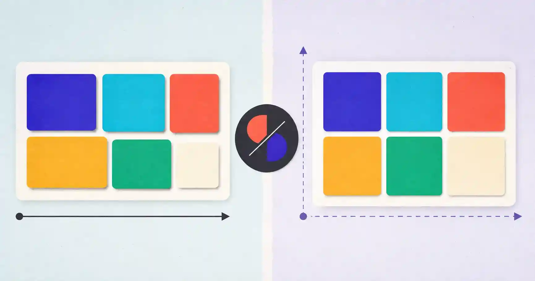
- CSS Flexbox is one-dimensional. It lays items out along a single axis at a time — either as a horizontal row or a vertical column. It is content-aware: items can grow, shrink, and wrap based on their own size and the space available.
- CSS Grid is two-dimensional. It positions items along two axes simultaneously, aligning rows and columns into a strict matrix. It is layout-first: you define the tracks, and items snap into them.
That is the whole mental model. Flexbox arranges things in a line; Grid arranges things in a grid.
When to use CSS Flexbox
Flexbox shines whenever items should sit in a single line and size themselves to their content. Reach for it for:
- Navigation bars: spacing a logo, links, and a profile button evenly across a header.
- Centered components: perfectly centering a modal or card both vertically and horizontally.
- UI controls and badges: aligning an icon next to button text, or a count badge next to a label.
- Form rows: placing an input next to a submit button.
The canonical "center anything" snippet is three lines:
/* Center an element with Flexbox */
.centered-card {
  display: flex;
  justify-content: center; /* main-axis alignment */
  align-items: center;     /* cross-axis alignment */
}
When to use CSS Grid
Grid is built for overall page structure and any layout where you need control over both dimensions at once:
- eCommerce product grids: uniform cards in a responsive multi-column layout.
- Dashboards: a sidebar, header, main area, and footer arranged together.
- Photo galleries: asymmetrical, magazine-style, or masonry layouts.
- Responsive card arrays: auto-fitting cards to the available width with no media queries at all.
That last case is Grid's party trick:
/* Responsive auto-fit grid, no media queries needed */
.product-grid {
  display: grid;
  grid-template-columns: repeat(auto-fit, minmax(280px, 1fr));
  gap: 1.5rem;
}
This one rule creates as many columns as fit, each at least 280px wide, and reflows automatically as the screen shrinks — behavior that once required a stack of breakpoints.
The comparison matrix
| Feature | CSS Flexbox | CSS Grid |
|---|---|---|
| Dimensions | 1D (row or column) | 2D (rows and columns) |
| Approach | Content-first (items fit their content) | Layout-first (items fit the tracks) |
| Item overlapping | Difficult / hacky | Native (via grid-area / line numbers) |
| Best for | Micro UI alignment and navigation | Overall page layout and macro card grids |
The decision framework
When you are unsure, ask two quick questions:
- Am I laying things out in one direction, or two? One direction (a row of buttons, a column of form fields) → Flexbox. Two directions (a full page, a gallery) → Grid.
- Should the layout dictate the items, or should the items dictate the layout? Layout-first (fixed tracks) → Grid. Content-first (items size themselves) → Flexbox.
You almost never regret following those two questions.
They are better together
The most common real-world pattern is not "Flexbox or Grid" — it is both. Use Grid for the macro layout (the page skeleton or the product grid container), then use Flexbox inside each grid cell to align the smaller elements (a card's image, title, price, and button). Grid handles the big picture; Flexbox handles the details. Learning to reach for each at the right scale is the mark of a developer who has internalized the tools.
Stop writing layout CSS by trial and error
Both modules have a lot of properties, and remembering the exact combination of justify-content, align-items, grid-template-areas, and gap is tedious. Visual generators let you drag the layout you want and copy clean, production-ready CSS — a huge time-saver whether you are learning or shipping.
Build Layouts Visually, Copy Clean CSS
Generate battle-tested layout code without the guesswork — everything runs in your browser:
- 📐 CSS Flexbox Generator: Tweak justify-content, align-items, and flex-direction with a live preview.
- 🔲 CSS Grid Generator: Build responsive grid tracks, template areas, and gaps visually.
- ✨ CSS Glassmorphism Generator: Create modern frosted-glass card effects and copy the CSS.
🔒 100% client-side privacy: code generation runs strictly inside your browser. No code or styling data is tracked or logged.
Alignment: the properties that actually confuse people
Most Flexbox and Grid frustration comes down to a handful of alignment properties that sound alike. A quick map:
justify-contentaligns items along the main axis (horizontal in a default flex row): use it for spacing a row of items left, center, right, or spread apart withspace-between.align-itemsaligns items along the cross axis (vertical in a default flex row): use it to center items on a line or stretch them to equal height.align-contentonly matters when items wrap onto multiple lines; it distributes those lines within the container.- In Grid,
justify-itemsandalign-itemsposition content within each cell, whilejustify-contentandalign-contentposition the whole grid within its container.
Once you internalize "justify = main axis, align = cross axis," the guesswork disappears.
The gap property replaced margin hacks
For years, spacing items meant fiddly margins and awkward "remove the margin on the last child" rules. The gap property — now supported in both Grid and Flexbox — replaces all of that with a single declaration that adds consistent spacing between items without adding it to the outer edges. gap: 1rem on a flex row or grid is cleaner, more predictable, and easier to maintain than any margin-based approach. If you learned layout more than a few years ago, adopting gap is one of the highest-value habit changes you can make.
Common layout bugs and their fixes
- A flex item overflows its container. Add
min-width: 0to the item; flex items default tomin-width: auto, which refuses to shrink below content size. - Images stretch oddly in a flex row. Set
align-items: flex-startor give the image a fixed height, since the defaultstretchdistorts them. - A grid ignores your column count on mobile. Use
repeat(auto-fit, minmax(...))so tracks collapse gracefully instead of forcing a fixed number. - Centering "doesn't work." Confirm the parent actually has
display: flexorgrid; alignment properties do nothing on a normal block element.
Knowing these four covers the majority of day-to-day layout head-scratchers.
Key takeaways
- Flexbox is one-dimensional (a row or a column); Grid is two-dimensional (rows and columns).
- Ask "one direction or two?" and "content-first or layout-first?" to choose instantly.
- Use them together: Grid for the page skeleton, Flexbox to align items inside each cell.
- Remember "justify = main axis, align = cross axis," and reach for
gapinstead of margin hacks. - Generate layouts visually to skip trial-and-error and copy clean, production-ready CSS.
Frequently asked questions
Can I use Flexbox and CSS Grid together on the same page?
Absolutely — it is standard practice. Use Grid for the overall page layout or product-grid container, and Flexbox to align the elements inside each grid item, such as buttons, titles, and pricing badges.
Does CSS Grid work on all mobile browsers?
Yes. CSS Grid has been fully supported across Chrome, Safari, iOS Safari, Firefox, and Edge since 2017. You can use it in production without fallbacks for any modern audience.
Is Flexbox being replaced by Grid?
No. They solve different problems. Grid is for two-dimensional layouts; Flexbox is for one-dimensional alignment. Modern CSS uses both, often on the same page.
Which should a beginner learn first?
Learn Flexbox first — it handles the most common day-to-day needs (centering, nav bars, button rows) and its mental model is simpler. Then add Grid for full-page and gallery layouts.